Tuesday, 3 December 2013

Sketch of street assignment

I took some buildings from the last post (with the photos) and made a quick sketch of what I want my street to look like. I'll probably model the buildings in 3D max then, after the models are ready and textured I'll put them in UDK.


Also the sketches of the Drill we had in class. They were easier to draw from the previous drills we had.  

Update for scene assignment

For my assignment in Visual Studies I was inspired by https://blogger.googleusercontent.com/img/b/R29vZ2xl/AVvXsEiEi_knHC-vBe-1BRHBKTbVWvxP3eO8Vh-MiqjXLU9iWFNGRID1Znw1_vtnLDPhhNfeYajyL-DUiNV0ETCR0xz6eLb1-zuj5ZWOCZY5JkudLxaF8TELdPQE-mSeYQGWZ_MDJ_lbeqWeUzA/s1600/Street.jpg this picture.
I want to make a street at night with lots of street lights, but yet keep kind of a gloomy and intriguing look.
Some of the building's would be little crooked and unnatural - fantasy like.
Here is some photo references I found for my research. (The link from where I found some will be under the pictures, others I found in google images)


http://www.1zoom.me/en/wallpaper/336426/z1223.2/%26original=1


https://www.facebook.com/ZdravkoYonchevPhotography


http://www.grantarmstrong.co.uk/


http://rafaarquitetura.blogspot.co.uk/

Buildings


Monday, 2 December 2013

More sketches... and thoughts.


Okay, so in Visual Studies class we had, yet again another drill.
A person once said "The trouble is, you think you have time." I sometimes tend to think that, but when it comes to drills, I always panic if the time will be enough to finish it.
Anyway here are the sketches from the drill:

For the first sketch we had to do a bridge, it wasn't that hard. I wanted to make the whole bridge, but sadly time wasn't enough, and we had to move onto the next picture.
The second picture to sketch was hell itself. I hated it, I don't even know how people are able to build...that sort of thing. Looking at the "sketch"you probably think it's just some swirls or a funny looking wave drawn by an 5 year old or less. To begin with, that's because I spend the past 5-10 min staring at the photo of the building. Good thing about this is, that it makes you appreciate what people can achieve.
But yet, I hated it.


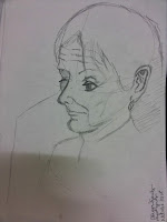
Moving onto the third one, we had to sketch an pretty shaded  photograph of an old woman, originally she was supporting her head with her hand, sadly I didn't have much time left, since I was busy staring at the extravagant swirls of the building. Anyway, I'm not happy with this one either. I don't know why but the style I drew her in looks kind of like an Anime style. In short I drew too many anime type figures in the past, and now when I try to draw realistic it takes..impact.
I'll have to practise a lot more.


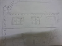
More sketches of Huddersfield buildings.


I managed to make these quicker than the last ones.
Of course they're not that good, the third one isn't shaded and all of them have crooked proportions.




Bonus sketches
A weapon design for Game Assets and an almost (not really) armour.           
 

Saturday, 16 November 2013

sketches of buildings


And so I guess I'm not good at all drawing buildings. As can be seen the sketches I made of the buildings on the left, are quite crooked and out of proportion. The shading and highlights are done wrong at some places.


Huddersfield has some pretty buildings though.
I'm starting to consider sketching whenever I have time outside.

Also went to the cemetery with a friend and found these:

Thursday, 14 November 2013

Drawings of a character with a book.

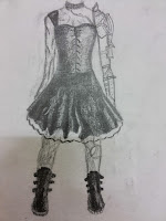
This is "the girl with a book" drawing that we had to do for our Visual Studies class. The first thing that came up to my mind was to draw a chibi with a book. The design of the girl was an inspiration driven by my friend at Uni. On the book of the girl there's a Hello Kitty logo which represents her love for....Hello Kitty.

My friend also wears glasses which I forgot to include...I'm sorry Alice. ^^'


After that I decided to draw another one just for fun, but this time using a photo reference. I wanted to draw  a realistic figure but it didn't turn out well.
Here is the girl I tried redrawing.


Monday, 4 November 2013

Fantasy Castle

 The first thing that came to my mind when hearing "Fantasy city" was a city on a giant platform rock floating through the sky. The source of my inspiration came from some books and movies that I was interested in a long time ago.

Inspiration pictures:

How's Moving Castle


    Laputa - Gulliver's Travels (Studio Ghibli's "Castle in the sky: Laputa)

 
Elder Scrolls Legends novel

The Castle I came up with:


For this project I used couple of buildings as followed in the tutorial. The platform for the castle was simply two mountains cropped and turned upside-down, then I used the two healing brushes and the patch tool in order to make a bigger platform. I also put a fence around the castle (so that the people won't be endangered living there). since it was just a plain floating castle (with no fancy gets to fly it around, only magic) I went on and added a dragon and a sky-ship.
The images for this project I found by searching in google.
The fence for the city was created in photoshop (by adding two pictures together) :

Fence

Platform


Conclusion
:
It is not perfect and the lighting is terribly wrong, some of the pictures are not well put together.

Tuesday, 8 October 2013

Picture for Visual Studies (video games)

 This is the picture that I'm going to use for my Visual Studies project.
Since I don't have any experience I'm going to do it without the rain, also I think of excluding the wires and the top left balcony. If I manage to finish with everything as planned and due date, I might continue and try to make the rainy effect.
Feedback:
  • The scene has many details and is realistically made
  • It has good contrast
  • Good use of dark tones
  • Creates a gloomy and mysterious mood
  • Good use of gloss effect
  • Has lots of dark spots making it hard to see clearly some of the textures
  • The artificial transmitter of light reflects glow on the ground and on some of the buildings
Lighting:

Because the picture is supposed to be taken in a rainy night the rain itself creates a blurred effect on the street and some of the buildings. The building lamp, which is brighter than the others, creates a lighter contrast with the building's shadows, making them even darker.
Since I won't be doing the rain the street would lose its gloss effect, and the light on the ground would not be so hazy.